In Dashbaord: Inbox Estimate Over Time, we looked at the second Dashboard that appears in Deployer, titled “Inbox Estimate Over Time.” We learned what each of the terms presented in Dashboards means– such as Hard Bounce, Over Quota Bounce, Domain Block, etc.
In this tutorial, we're looking at the next big Dashboard found in Deployer: Delivery Over Time By Domain.
But first. . .
Let’s start with the basics. What is a domain?
Simply put, a domain is a name associated with a particular server. This is true in regard to email and websites. When mailing to curiousgeorge@gmail.com, Gmail is the domain. When mailing to yippeehippee@yahoo.com, Yahoo is the domain.
Yahoo, Google, and others also provide custom domains to users (for example, @company.com). However, since the same rules and guidelines apply, Deployer recognizes these custom domains as under the umbrella of their provider; ie. all Gsuite addresses are rolled up under "Google," and all domains hosted by Yahoo (like aol.com and verizon.net) are rolled up under "Yahoo."
Domains matter a lot in email marketing. Here are two major reasons why:
Reading Deployer Dashboards: Delivery Over Time By Domain
In Deployer, the third major Dashboard from the top is Delivery Over Time By Domain. This Dashboard contains a total of four interactive graphic charts, as shown below.

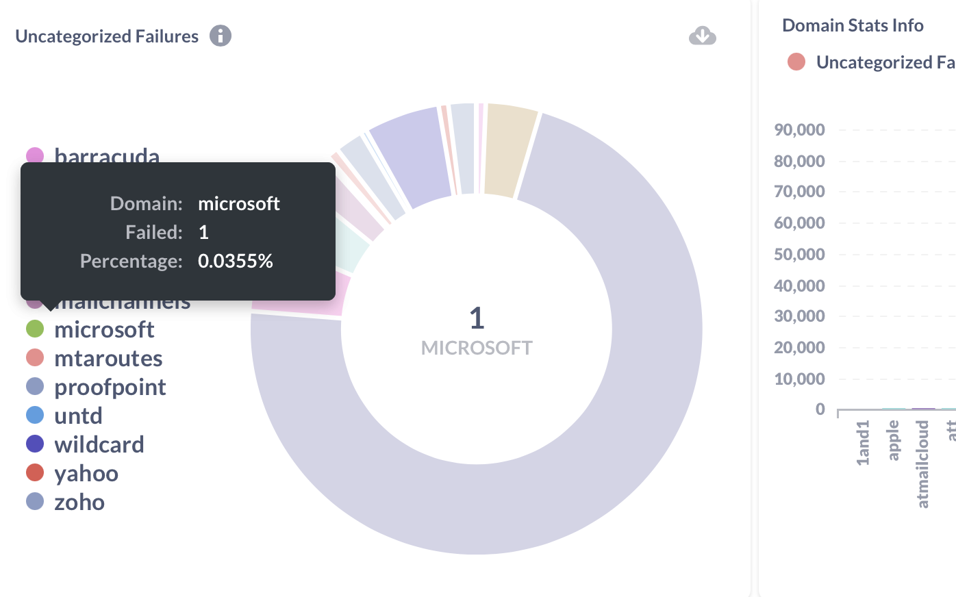
► The top left graphic shows a pie chart breaking down only the Uncategorized Failures by domain. These are failures that result from new, unrecognized error codes from an email provider. Deployer catches the error and our team adds an entry to categorize it. In this way, our system is always adapting to providers' new practices. Hover your mouse over each piece of the pie or over a particular domain on the left to learn more.
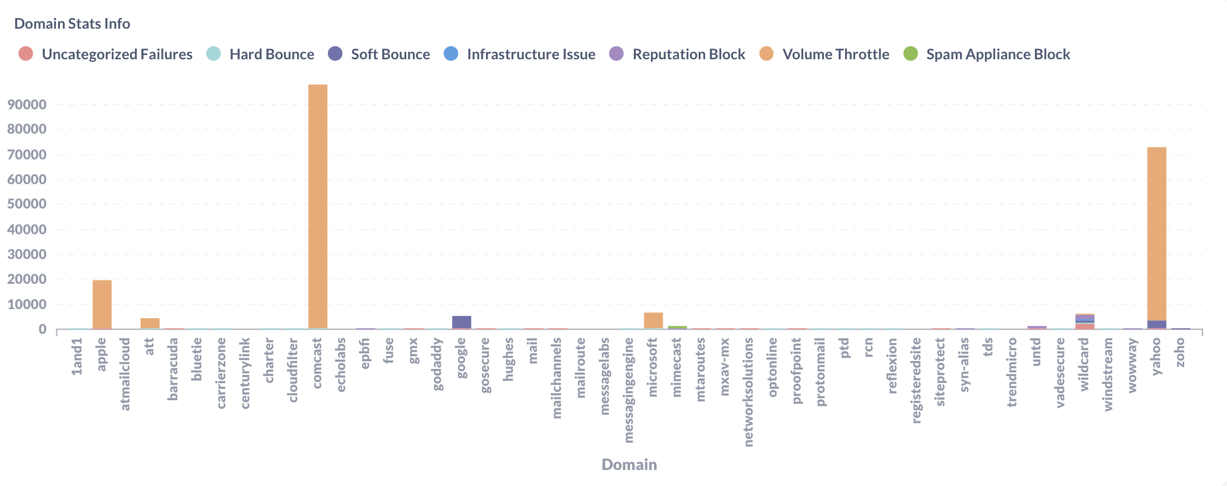
► The top right graph shows a chart of Domain Stats Info, with the Domains on the X-axis and the number of failures on the Y-axis, with the color-coded causes of failure we learned last week.
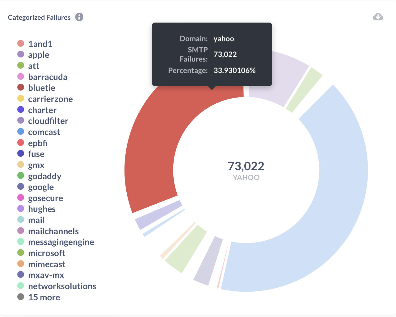
► The bottom left graphic displays a pie chart of only the Categorized Failures. Hover your mouse over the chart or the domains listed on the left-hand side for more information.
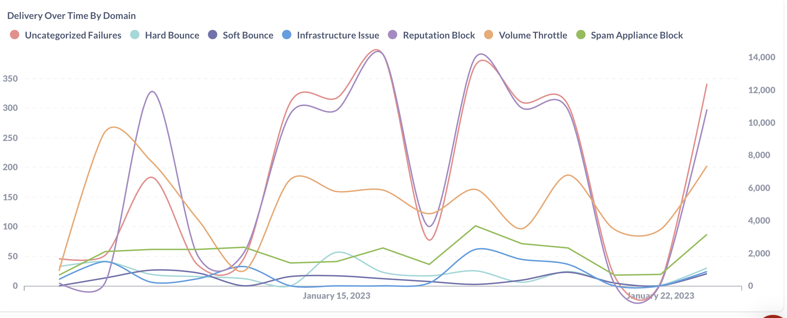
► The bottom right graphic is a chart of Delivery Over Time By Domain. *Note: Here, the X-axis is the timeline, the left Y-axis is the count, and the right Y-axis continues the count for higher-volume fields. When you hover over a line in the graph, either the right or left Y-axis will be used depending on the count.
The four interactive graphs combined in the Delivery Over Time By Domain dashboard provide an excellent way to view, at a glance, how your deliverability is going with different domains.
In this tutorial, we're looking at the next big Dashboard found in Deployer: Delivery Over Time By Domain.
But first. . .
Let’s start with the basics. What is a domain?
Simply put, a domain is a name associated with a particular server. This is true in regard to email and websites. When mailing to curiousgeorge@gmail.com, Gmail is the domain. When mailing to yippeehippee@yahoo.com, Yahoo is the domain.
Yahoo, Google, and others also provide custom domains to users (for example, @company.com). However, since the same rules and guidelines apply, Deployer recognizes these custom domains as under the umbrella of their provider; ie. all Gsuite addresses are rolled up under "Google," and all domains hosted by Yahoo (like aol.com and verizon.net) are rolled up under "Yahoo."
Domains matter a lot in email marketing. Here are two major reasons why:
- Each domain you send to has guidelines and rules for accepting mail. If you break these guidelines, the providers can throttle or block your delivery.
- The domain you send from will gain a reputation. Having a good reputation means higher deliverability!
Reading Deployer Dashboards: Delivery Over Time By Domain
In Deployer, the third major Dashboard from the top is Delivery Over Time By Domain. This Dashboard contains a total of four interactive graphic charts, as shown below.

► The top left graphic shows a pie chart breaking down only the Uncategorized Failures by domain. These are failures that result from new, unrecognized error codes from an email provider. Deployer catches the error and our team adds an entry to categorize it. In this way, our system is always adapting to providers' new practices. Hover your mouse over each piece of the pie or over a particular domain on the left to learn more.

► The top right graph shows a chart of Domain Stats Info, with the Domains on the X-axis and the number of failures on the Y-axis, with the color-coded causes of failure we learned last week.

► The bottom left graphic displays a pie chart of only the Categorized Failures. Hover your mouse over the chart or the domains listed on the left-hand side for more information.

► The bottom right graphic is a chart of Delivery Over Time By Domain. *Note: Here, the X-axis is the timeline, the left Y-axis is the count, and the right Y-axis continues the count for higher-volume fields. When you hover over a line in the graph, either the right or left Y-axis will be used depending on the count.

The four interactive graphs combined in the Delivery Over Time By Domain dashboard provide an excellent way to view, at a glance, how your deliverability is going with different domains.


