Let's continue our deep dive into Deployer Dashboards and take a look at Delivery Over Time By IP. Make sure to check out the entire Deployer Dashboards Lesson Track if you haven't already.
IPs are in the title of the dashboard we're looking at today, which begs the question...
What's the difference between a domain name and an IP address?
(If you already know, scroll through. I won't be offended.)
Imagine the contacts list on your phone...
You have dozens or hundreds of names, each associated with a phone number. When you want to call your good buddy, Bill Bogart, there are two ways to do so: you can dial his phone number, or you can call him using his contact.
In this analogy, domain names are the contact name and IP addresses are the phone number.
IP addresses consist of a series of digits, which is ideal for systems communicating, but not so ideal for humans. We prefer names we can remember, like marketrithm.com. This is why we use Domain Name System (DNS) to translate domain names into IP addresses for computers to use.
Now that we have the basics, let's dive into the dashboard!
Reading Deployer Dashboards: Delivery Over Time By IP
In Deployer, the fourth major Dashboard from the top is Delivery Over Time By IP. This Dashboard contains a total of four interactive graphic displays, as shown below.
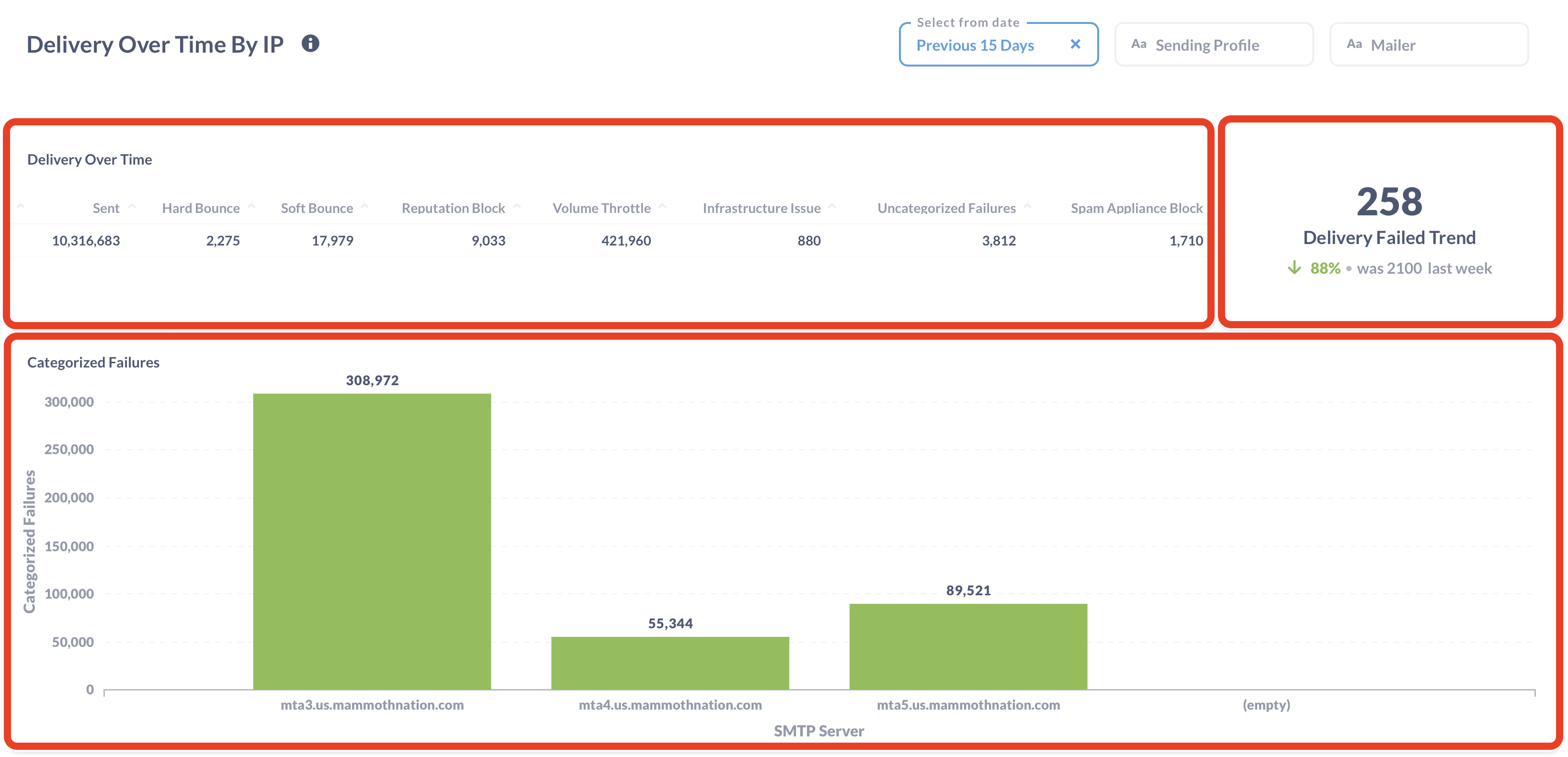

► On the top left, you'll find Delivery Over Time with a simple count of several types of delivery failures. *Note, you can adjust the time period, sending profile, and mailer top right corner of the dashboard. These ramifications apply to all material within the dashboard, except for the top right Delivery Failed Trend. Also, note that you can click on the cloud button in each display to download the full results, as shown below.

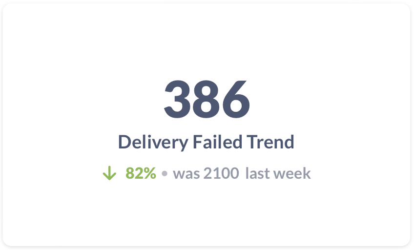
► The top right box displays the Delivery Failed Trend. This displays the sum of all categorized failures for the week (calendar week, from Sunday - Saturday), as well as a percentage comparing the count to the previous week. This is the only component of the dashboard that is not affected by the date range selected.
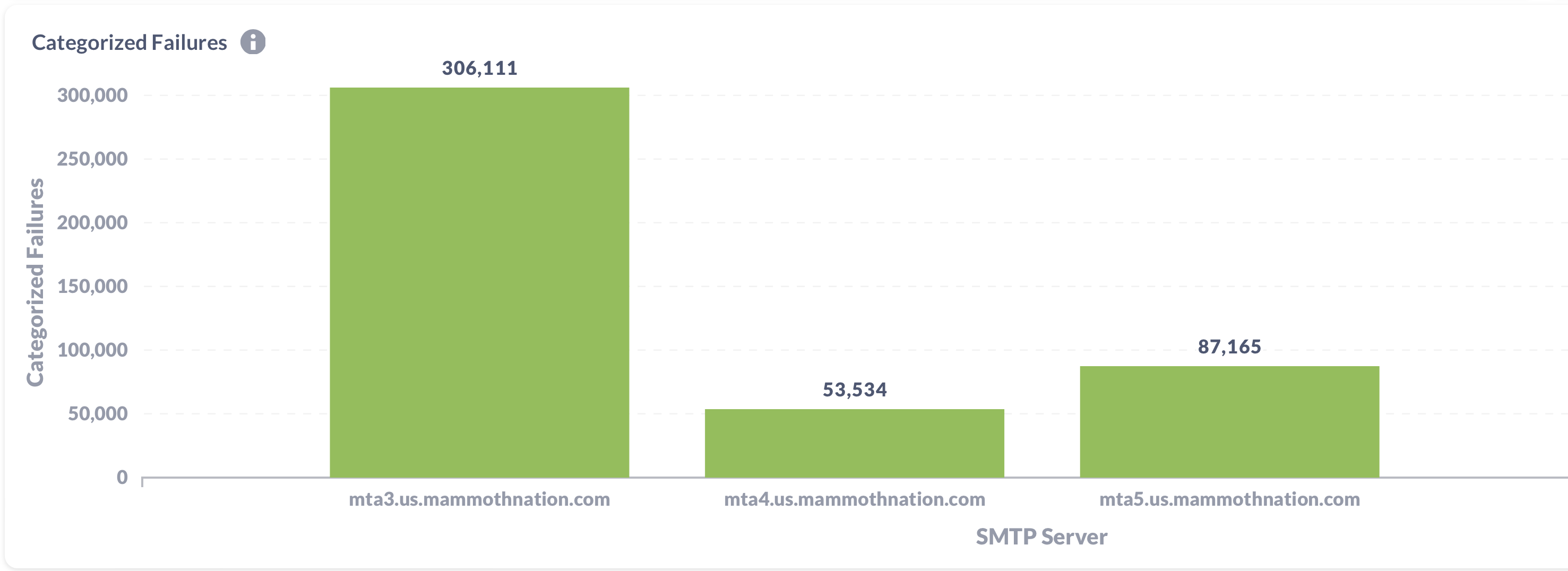
► The next graph displays Categorized Failures by mta profile. Deployer uses 3 separate mta profiles for optimized deliverability. This example displays a typical distribution of failure among the mta profiles.
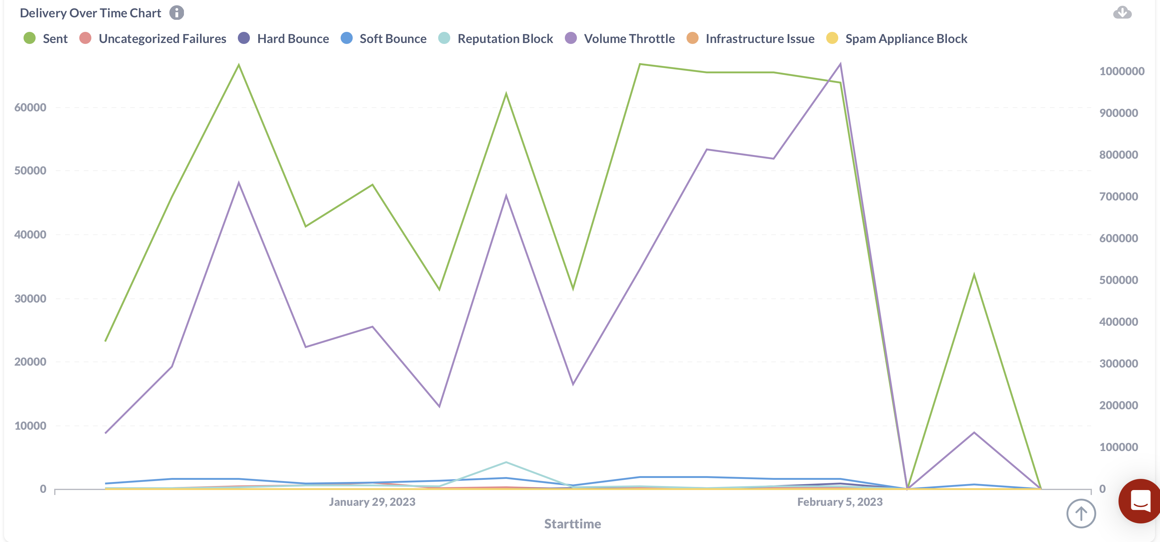
► Finally, we have the Delivery Over Time Chart on the bottom of the dashboard. Similar to previous graphs, here you'll find Sent, Uncategorized Failures, Hard Bounce, Soft Bounce, etc. outlined in a graph. Again, depending on the ramifications set in the top right of the dashboard, you can filter the results by time, sending profile, or mailer.
The four interactive graphs combined in the Delivery Over Time By IP dashboard provide an excellent way to view, at a glance, how your deliverability is going across different sending profiles or mailers.
Now... Until our next deep dive, time to come up for air!
IPs are in the title of the dashboard we're looking at today, which begs the question...
What's the difference between a domain name and an IP address?
(If you already know, scroll through. I won't be offended.)
Imagine the contacts list on your phone...
You have dozens or hundreds of names, each associated with a phone number. When you want to call your good buddy, Bill Bogart, there are two ways to do so: you can dial his phone number, or you can call him using his contact.
In this analogy, domain names are the contact name and IP addresses are the phone number.
IP addresses consist of a series of digits, which is ideal for systems communicating, but not so ideal for humans. We prefer names we can remember, like marketrithm.com. This is why we use Domain Name System (DNS) to translate domain names into IP addresses for computers to use.
Now that we have the basics, let's dive into the dashboard!
Reading Deployer Dashboards: Delivery Over Time By IP
In Deployer, the fourth major Dashboard from the top is Delivery Over Time By IP. This Dashboard contains a total of four interactive graphic displays, as shown below.


► On the top left, you'll find Delivery Over Time with a simple count of several types of delivery failures. *Note, you can adjust the time period, sending profile, and mailer top right corner of the dashboard. These ramifications apply to all material within the dashboard, except for the top right Delivery Failed Trend. Also, note that you can click on the cloud button in each display to download the full results, as shown below.

► The top right box displays the Delivery Failed Trend. This displays the sum of all categorized failures for the week (calendar week, from Sunday - Saturday), as well as a percentage comparing the count to the previous week. This is the only component of the dashboard that is not affected by the date range selected.

► The next graph displays Categorized Failures by mta profile. Deployer uses 3 separate mta profiles for optimized deliverability. This example displays a typical distribution of failure among the mta profiles.

► Finally, we have the Delivery Over Time Chart on the bottom of the dashboard. Similar to previous graphs, here you'll find Sent, Uncategorized Failures, Hard Bounce, Soft Bounce, etc. outlined in a graph. Again, depending on the ramifications set in the top right of the dashboard, you can filter the results by time, sending profile, or mailer.

The four interactive graphs combined in the Delivery Over Time By IP dashboard provide an excellent way to view, at a glance, how your deliverability is going across different sending profiles or mailers.
Now... Until our next deep dive, time to come up for air!


